

UI DESIGn
concho well maintenance app
Problem
Concho Resources, a petroleum company based in Midland, Texas, required a mobile app to support technicians working in remote areas of West Texas. Many wells were located in regions without cell coverage, forcing technicians to travel to areas with service to access the web platform and send or receive updates. This workflow was inefficient, time-consuming, and negatively impacted productivity.
goal
The objective was to create a mobile app that consolidated well information, provided real-time updates when possible, and functioned seamlessly offline. While a prototype existed, the client was not fully satisfied with its design or usability. They sought a more polished, visually appealing solution that would improve adoption and efficiency among field technicians.
My Role
As the UI designer, I collaborated directly with Concho’s team through on-site meetings to understand workflows and the unique challenges technicians faced in the field. My focus was on refining the user interface to align with Concho’s brand standards while ensuring a seamless, intuitive experience, making the app efficient, reliable, and user-friendly in remote environments.
Design Approach
Since the product’s core interactions were already defined, my focus centered on elevating the user interface through stronger visual design principles. I introduced clear typographic hierarchy, consistent use of color and contrast, and simplified layouts to reduce visual noise. Each screen was restructured to prioritize essential data points, enabling technicians to scan and process information quickly in the field.
I also refined spacing, alignment, and component consistency to create a balanced visual rhythm across the app. By aligning with Concho’s brand standards and applying a cohesive design system, the interface became both intuitive and visually polished while supporting technician workflows without altering the established functionality.
BEFORE AND AFTER
The following examples showcase key improvements made throughout the app. Although they do not capture every screen I redesigned, they reflect the consistent approach I applied to elevate clarity, usability, and visual alignment with the brand.
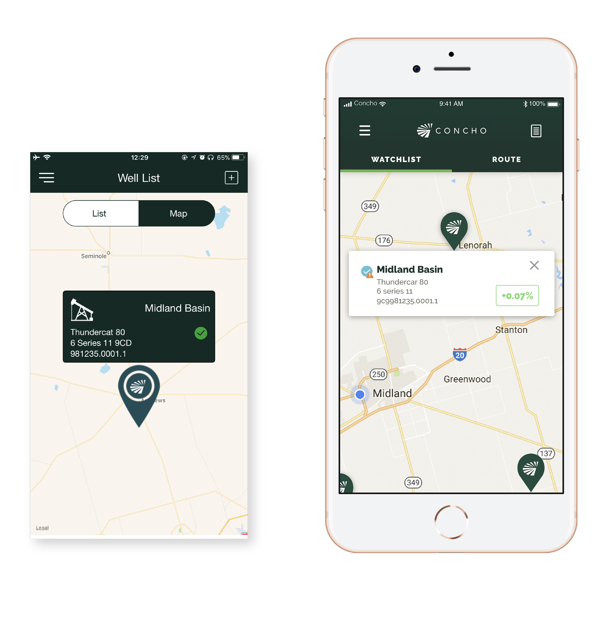
Well list screen
On the Well List screen, my goal was to reduce unnecessary visual weight and present information in a clearer, more functional way. The original layout gave disproportionate space to the production percentage and used arrows that were redundant, since the green or red color already communicated performance status. I transformed this by adjusting hierarchy and removing clutter.
The well icon, which consumed valuable space without adding meaning or functionality, was replaced with a status icon to indicate whether a well was operational, offline, or required attention with a warning marker.
To further improve readability, I established a clear font hierarchy that emphasized the well’s name, preventing it from blending into secondary details such as type, location, and unique code. These changes allowed technicians to scan the list more efficiently and focus immediately on critical information.
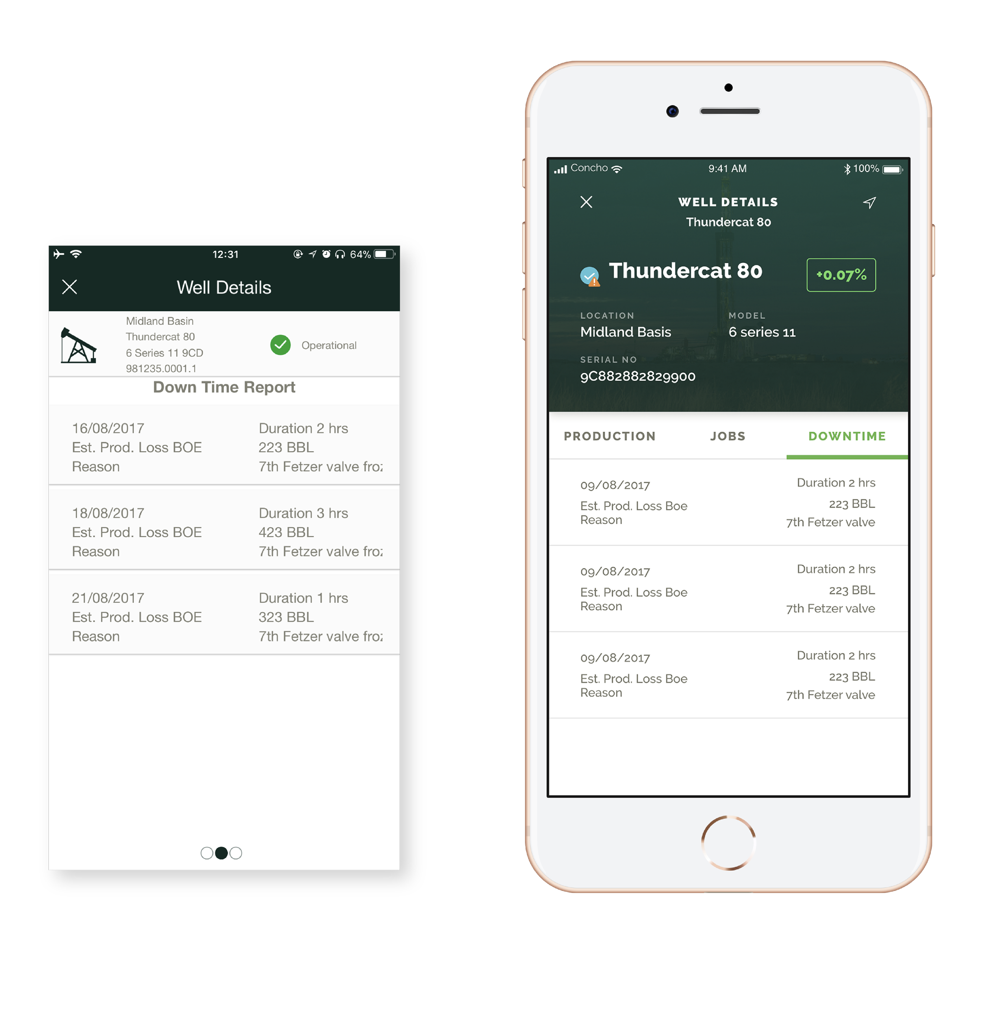
well details Screen
On the Well Details screen, I prioritized the visibility of critical well information, which had previously been cluttered and difficult to access at the top of the layout. The original design used small dots as scroll indicators to switch between production, jobs, and downtime, leaving technicians unsure of what information they were viewing. I redesigned this interaction by introducing labeled tabs, making each category explicitly clear and allowing users to jump directly to the data they needed without unnecessary scrolling. This reduced clutter, improved navigation, and ensured that technicians could quickly access the right information. Overall, the redesign created a cleaner, more structured experience that made complex well data easier to understand and act upon.
menu screen
Previously, the company logo occupied too much space, limiting visibility of the available features. I shifted focus to the menu options themselves, giving them greater prominence to help technicians quickly access core functions. To improve navigation, I introduced an active state indicator (highlighting the current section with a distinct color) so users always know where they are within the app. I also integrated the sync status directly into the menu, allowing technicians to check when data was last updated without needing to navigate to a separate screen—reducing unnecessary taps.

Unified iPad Interface
When I approached the iPad design, I wanted to take full advantage of the larger screen size to simplify how technicians accessed information. On smaller devices, the list and map views had to be separated, forcing users to toggle between them. I saw an opportunity to merge these into a single interface on the iPad, giving users the ability to see well details alongside their locations in real time. This integration not only eliminated extra navigation steps but also made it easier for technicians to cross-reference data and make decisions more quickly in the field. By designing the iPad app from the ground up, I was able to create a tool that felt both intuitive and powerful, tailored specifically to the needs of users working with complex well data.


Outcome
The mobile and iPad apps gave technicians and operators a clear, easy-to-use tool for managing well information. By simplifying navigation, presenting data clearly, and reducing clutter, users could quickly find and understand critical details. Together, they created a reliable and intuitive tool that supports technicians in the field at all times.