
BRANDING / UI/UX
Ascend
Ascend was created as a ready-to-launch brand designed to support a new realtor app, blending a strong visual identity with intuitive UI/UX. I developed the brand system from the ground up, building a versatile design language that translates seamlessly across digital and print. From the logo and color palette to the app’s user flows and interface components, every detail was crafted to reflect the brand’s values and provide users with a clear, engaging experience.
BRAND IDENTITY DEVELOPMENT
Logo Design
For Ascend, I designed a logo that conveys the brand’s focus on progress, ambition, and real estate expertise. At its core, the mark integrates three elements into a single, cohesive form: the structure of a house, an upward arrow symbolizing growth, and the letter “E” from the brand name.
The house grounds the identity in real estate, while the arrow reflects Ascend’s mission of elevating both agents and clients toward new opportunities. By embedding the “E” into this symbol, the logo remains distinctive and tied directly to the brand name. The result is a modern, versatile mark that embodies Ascend’s promise of elevating real estate excellence.

BRAND IDENTITY DEVELOPMENT:
Design System and Color Palette
The visual system extends Ascend’s core idea of upward momentum through a custom pattern of ascending arrows. This motif reinforces the brand’s name and mission while creating a dynamic texture that can be scaled across digital and print applications. The repeated arrows serve as a subtle reminder of growth and progress, giving the brand a distinctive property that ties every touchpoint back to its identity.
Complementing this, Ascend’s color palette balances strength and sophistication. Deep teal conveys stability and trust, while vibrant orange brings energy and forward momentum. Soft neutrals in sandy beige and light gray provide balance and clarity, ensuring the brand feels both approachable and professional. Together, the pattern and palette create a cohesive system that reflects Ascend’s mission to elevate real estate with confidence, warmth, and modernity.
BRand Applications
The strength of a brand lies in its consistency across every interaction. For Ascend, the visual identity was extended into key applications to ensure the brand is recognizable, professional, and cohesive at every touchpoint. From digital platforms to printed materials, the system was designed to communicate reliability and ambition while maintaining visual clarity and distinction.
Environmental Applications
To ensure visibility beyond the digital and corporate space, the brand was extended into environmental applications such as signage, vinyls, and large-format graphics. Designed to be flexible and scalable, these materials allow Ascend to stand out in both commercial and residential contexts. Whether applied to building façades or sales offices, the visual system adapts seamlessly, maintaining clarity and recognition at any scale while reinforcing the brand’s presence in the real estate landscape.
Corporate Materials
To establish a strong and credible presence, we created essential corporate assets such as stationery, letterheads, and business cards. These applications not only reinforce the brand’s professionalism but also provide a unified experience in both internal and client-facing interactions. By applying the visual system consistently, each piece strengthens brand recognition and supports Ascend’s reputation in the real estate market.
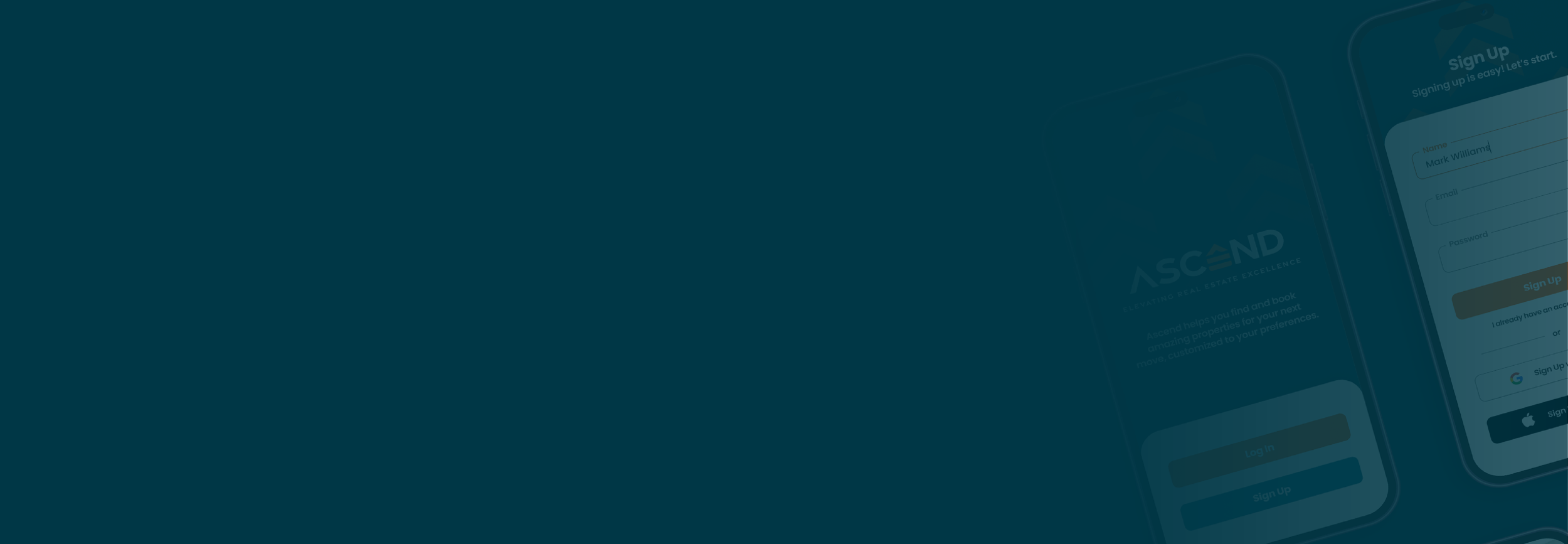
product design
At the core of Ascend is a realtor app designed to connect clients with properties in a clear and engaging way. The app extends the brand’s identity into a functional digital experience, ensuring that users not only recognize the brand but also interact with it seamlessly in their property search journey. Every element of the interface was crafted to balance usability, clarity, and trust, reinforcing Ascend’s mission to elevate the real estate experience.

User Flow and Wireframing
To define the app experience, I developed wireframes that mapped out the user journey from browsing listings to contacting an agent. The flow illustrates how users can easily search, filter, and explore properties, with clear pathways to view details, save favorites, and reach out for more information. By structuring the navigation in a logical sequence, the wireframes established a foundation for an intuitive interface that makes property discovery and communication seamless.

