
UI/UX DESIGN
diebold nixdorf ATM Maintenance app
CHALLENGE
Diebold Nixdorf, a global leader in financial and retail technology, depended on ATM technicians to generate automatic reports via voice recordings. However, technicians frequently forgot to disable voice recording during their tasks, producing reports cluttered with irrelevant background noise and off-topic conversations. This compromised the professionalism and reliability of reports, sometimes impacting the company’s reputation.
Goal
The objective was to design a user-centered app that streamlined report generation, reduced errors, and improved the accuracy and professionalism of documentation. The solution needed to integrate smoothly into technicians’ existing workflows while minimizing manual input and cognitive load, ultimately enhancing operational efficiency.
My Role
As the UI/UX designer, I collaborated directly with the Diebold Nixdorf team through on-site workshops and interviews to uncover pain points and requirements. I designed an intuitive, workflow-focused interface that empowered technicians to create high-quality reports consistently, supporting both user needs and organizational standards.
Blueprinting
User Flow
We began with a user flow diagram to map out the technician’s journey step by step. The flow covered every stage, from logging in and recovering a password to generating a report, entering an ATM ID, and completing nine inspection steps before reaching confirmation and success. By visualizing the entire process, we could identify decision points and ensure the app aligned with how technicians actually worked, not just how it was imagined on paper.
BLUEPRINTING:
Wireframing and Information Architecture
Building on this flow, we created wireframes that mirrored Diebold’s linear maintenance process. Each of the nine inspection steps became a distinct screen, reflecting the sequence technicians follow in the field. The main challenge was handling conditional paths—where certain steps could be skipped depending on earlier inputs. To solve this, we mapped every possible path in a detailed Excel sheet. This ensured that the app remained accurate and efficient, no matter the scenario.
BLUEPRINTING:
Prototyping
With the structure in place, we developed an interactive prototype in Kony Visualizer. The focus was on interactions and flow rather than visual polish, giving the team a tangible way to test the app’s logic. By validating the experience early, we reduced the risk of costly changes later and built confidence that the solution addressed real technician needs.
UI COMPONENTS AND NAVIGATION
UI Components
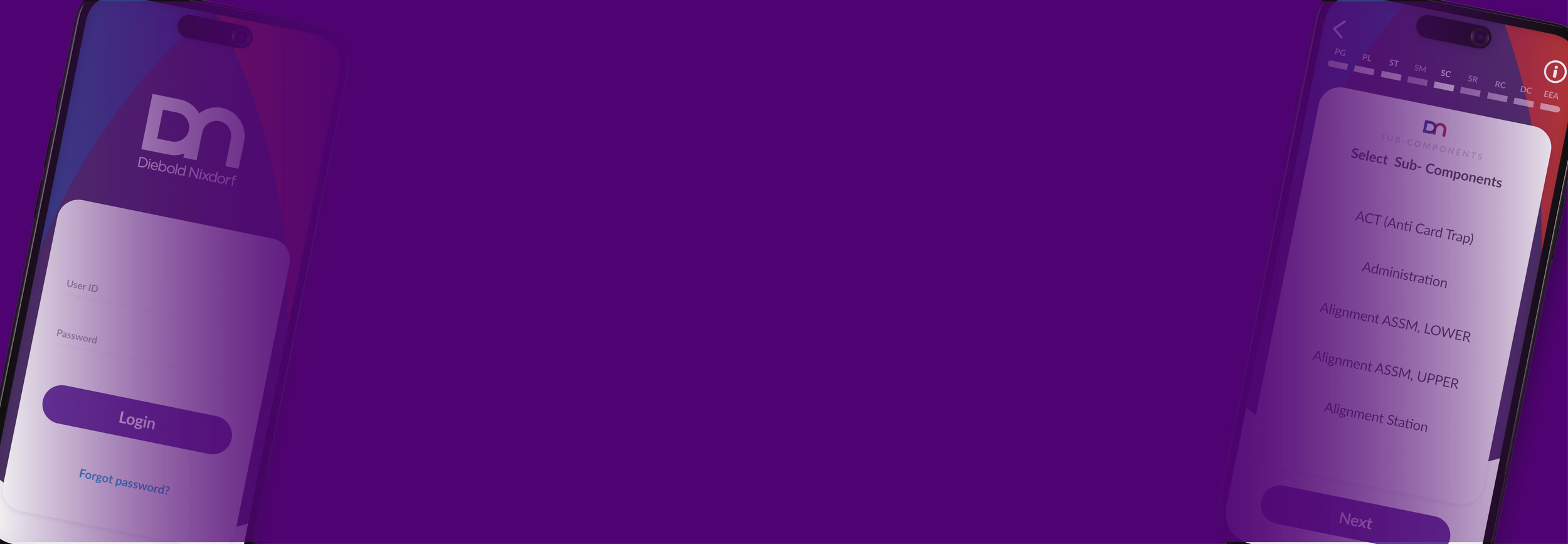
To support clarity and usability, we defined a set of UI components early in the process. The color palette was chosen to maximize readability and provide strong cues for system states such as errors and confirmations. Typography was selected for legibility across devices and varying screen sizes. Establishing these components at the start created consistency across every screen, lowering the learning curve for technicians and ensuring smooth communication through design.
UI COMPONENTS AND NAVIGATION:
Navigation
With the foundation established in the prototype, the focus shifted to refining the key navigation elements that would guide technicians through their workflows. The goal was to ensure that movement across the app remained simple, predictable, and efficient, supporting quick decision-making in the field. This work emphasized clarity and usability in two key areas.

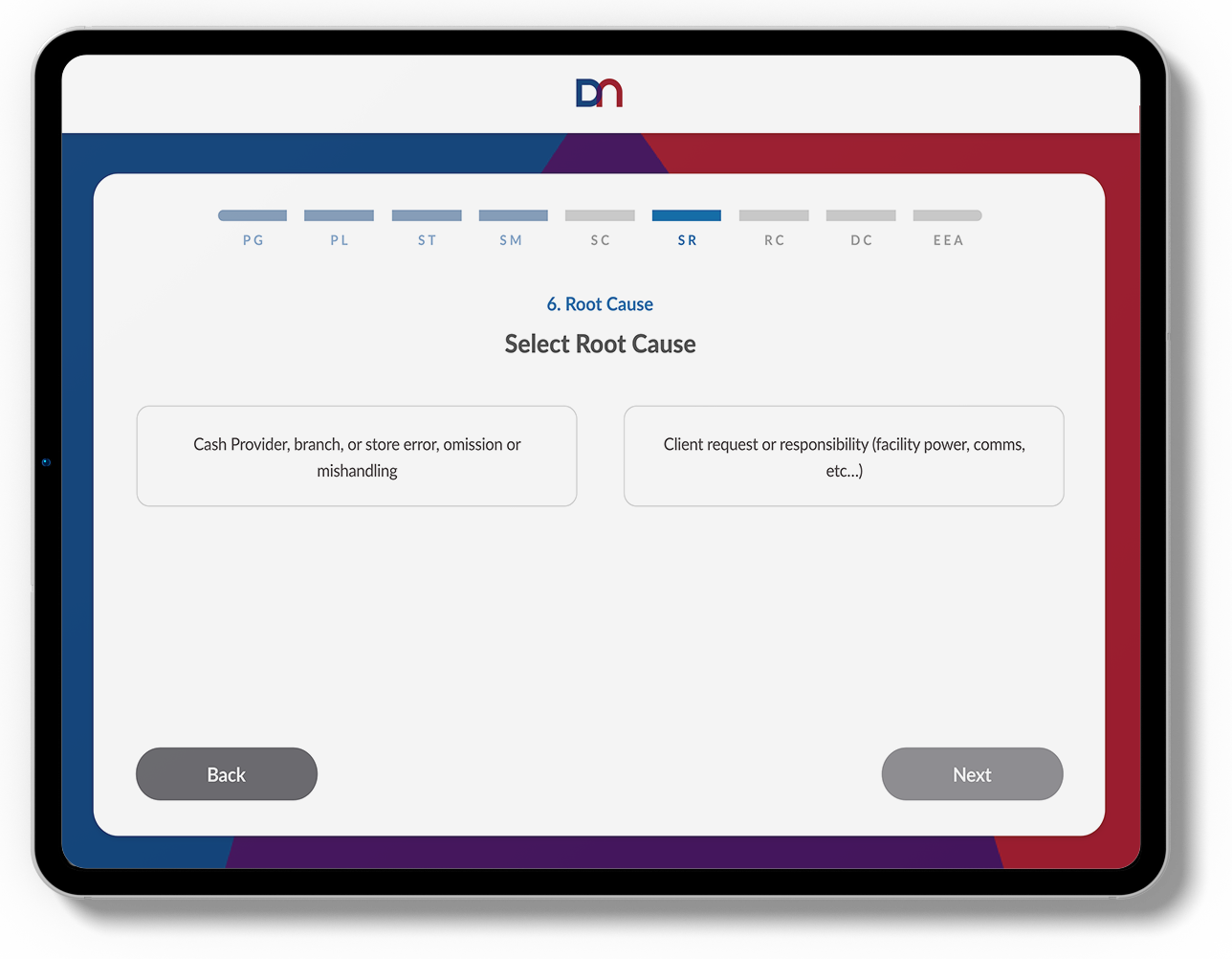
1. Alphabetical Options List
The priority was to display the list of available options for technicians in alphabetical order. This clear arrangement eliminates guesswork, allowing technicians to quickly locate the desired function without unnecessary searching. The simplicity of this structure supports faster decision-making and improves efficiency in the field.
2. Abbreviated Breadcrumb Navigation
The breadcrumb navigation uses concise abbreviations for each step in the process. This provides technicians with an immediate understanding of their current position within the workflow. The abbreviated format keeps the navigation compact and unobtrusive, while still delivering essential context for a smoother user experience.


Cross-Platform Adaptation

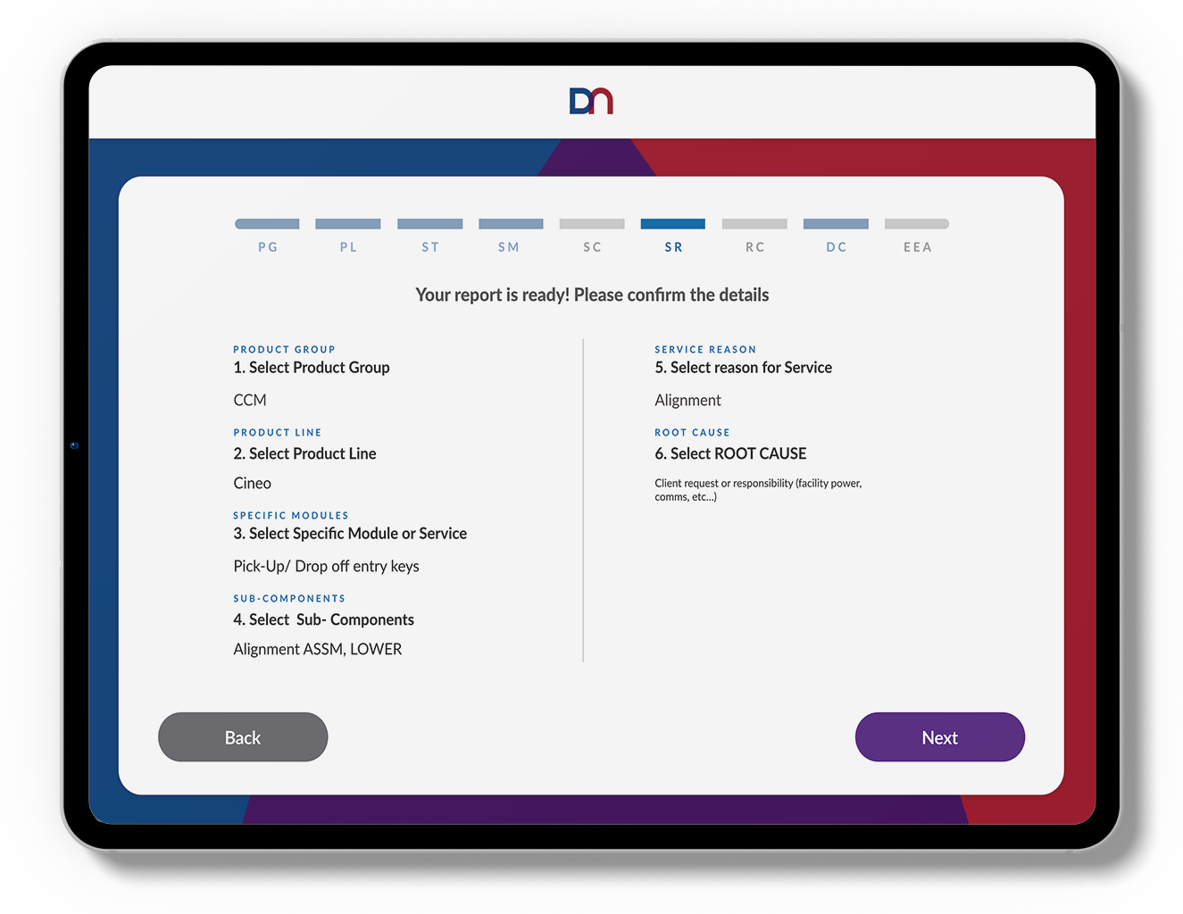
Once the mobile design was established, we adapted the app for iPad. The larger screen allowed all options to be displayed at once, reducing scrolling and giving technicians a complete view of possible issues in a single glance. By maintaining the same design language across devices, the experience stayed consistent and familiar while taking advantage of the expanded space.

The resulting app
The resulting app transformed report generation into a structured, reliable process that technicians could trust. By replacing voice recordings with predefined options, reports became faster, more accurate, and consistently professional. Intuitive workflows reduced errors, while a clear, consistent design across mobile and iPad ensured dependability in the field. What began as a challenge with noisy, unreliable reports evolved into an opportunity to empower technicians with a tool that elevated their performance, saved valuable time, and strengthened Diebold Nixdorf’s reputation for innovation and quality.