
EVENT BRANDING
AMWAY GROWTHCAMP 2023
GrowthCamp 2023 united Amway’s global leaders to inspire collaboration and strengthen connection. As creative lead, I developed the event’s brand identity from the ground up, designing a cohesive visual system that reflected Amway’s mission and values. Every touchpoint, from immersive stage design and large-scale signage to presentations and attendee materials, carried the brand seamlessly before, during, and after the event.
BRAND IDENTITY DEVELOPMENT
Logo Design
For GrowthCamp, I designed a logo that captures the event's focus on collaboration, strategy, and growth. It's built around Amway's "A" mark, combined with a fire to represent energy and connection, and a star as a guiding force.
The fire symbolizes the exchange of ideas, while the star reflects a shared vision for global growth. The result is a strong, simple mark that reinforces GrowthCamp's mission of bringing leaders together to align and move forward.

BRAND IDENTITY DEVELOPMENT:
Design System and Color Palette
The visual system drew inspiration from California’s topography, echoing the event theme of a shared journey. Layered contour lines symbolized routes and direction, creating a dynamic graphic language that conveyed exploration and forward momentum.
The color palette was inspired by Huntington Beach’s natural landscape with ocean blues, sandy neutrals, and muted coastal tones. These colors balanced energy and calm, grounding the event in its setting while underscoring themes of progress and unity.

BRAND IDENTITY DEVELOPMENT:
Brand Guidelines
To ensure consistency and scalability, I created a complete set of brand guidelines that documented every element of the GrowthCamp identity. The guide outlined logo usage, margins, and spacing rules, along with clear direction on photography style, tone of voice, and typographic hierarchy. It also included guidance on color application, pattern usage, and layout grids to unify all event materials. This framework served as a practical tool for both internal teams and external partners, making it easy to apply the brand cohesively across digital, print, and environmental touchpoints.
Event Applications
The GrowthCamp identity extended beyond visuals and became a complete brand experience. Every graphic element was designed with purpose, guiding leaders through the event journey from the anticipation of arrival to the shared moments on site and the reflections afterward. By applying the system consistently across print, digital, and environmental touchpoints, the event graphics not only unified the experience but also reinforced the themes of collaboration, progress, and collective growth.
Event: On-Site Experience
During the event, every touchpoint was designed to immerse participants in the GrowthCamp identity and encourage active engagement. Large roll-up banners served as visual landmarks, guiding attendees through the space while reinforcing the brand. Custom name badges were created to be both functional and memorable, helping leaders connect more easily. The Trail Guide, a notebook designed exclusively for GrowthCamp, provided space for note-taking and reflection, incentivizing participation and giving attendees a tangible tool to carry their insights forward. Stickers added a playful, collectible element that extended the identity into smaller, personal moments. Together, these pieces created a cohesive environment that supported connection, learning, and growth throughout the event.
Pre-Event: Setting the Stage
In the weeks leading up to GrowthCamp, the brand identity was introduced through personalized and practical touchpoints designed to build anticipation and ensure a smooth arrival. Each guest received a personal invitation from the CEO, reinforcing the significance of their participation. A detailed map was provided to help attendees easily navigate the venue and campus. To keep everyone connected and informed, a dedicated WhatsApp group was created, giving participants instant access to updates, schedules, and key information right from their phones. These pre-event materials established a sense of welcome, clarity, and excitement before attendees even stepped on site.
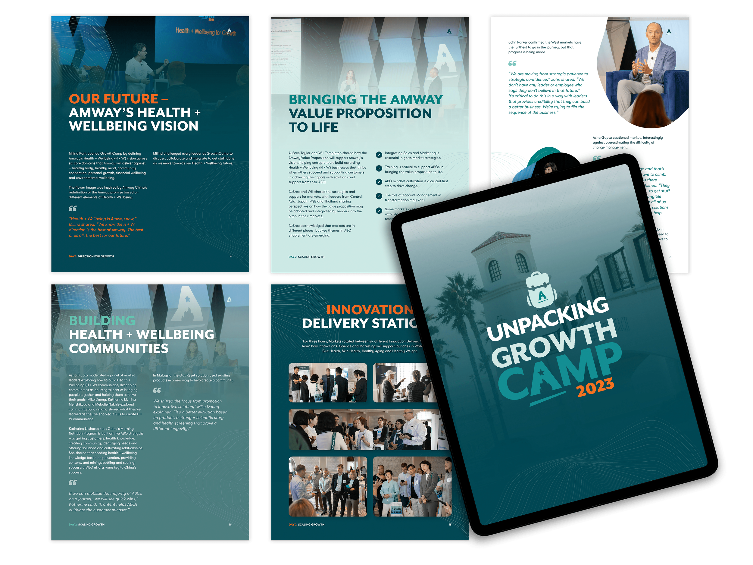
Post-Event: Unpacking GrowthCamp
To extend the impact of GrowthCamp beyond the event itself, I designed Unpacking GrowthCamp, a 30-page visual summary capturing the highlights, key learnings, and moments of connection. The piece was intentionally crafted to be highly engaging, balancing concise storytelling with a strong emphasis on visuals. Quotes from leaders were elevated to reinforce key messages, while dynamic layouts kept the content accessible and memorable. This summary served as both a keepsake and a practical reference, helping participants revisit insights and carry the momentum of GrowthCamp into their work.
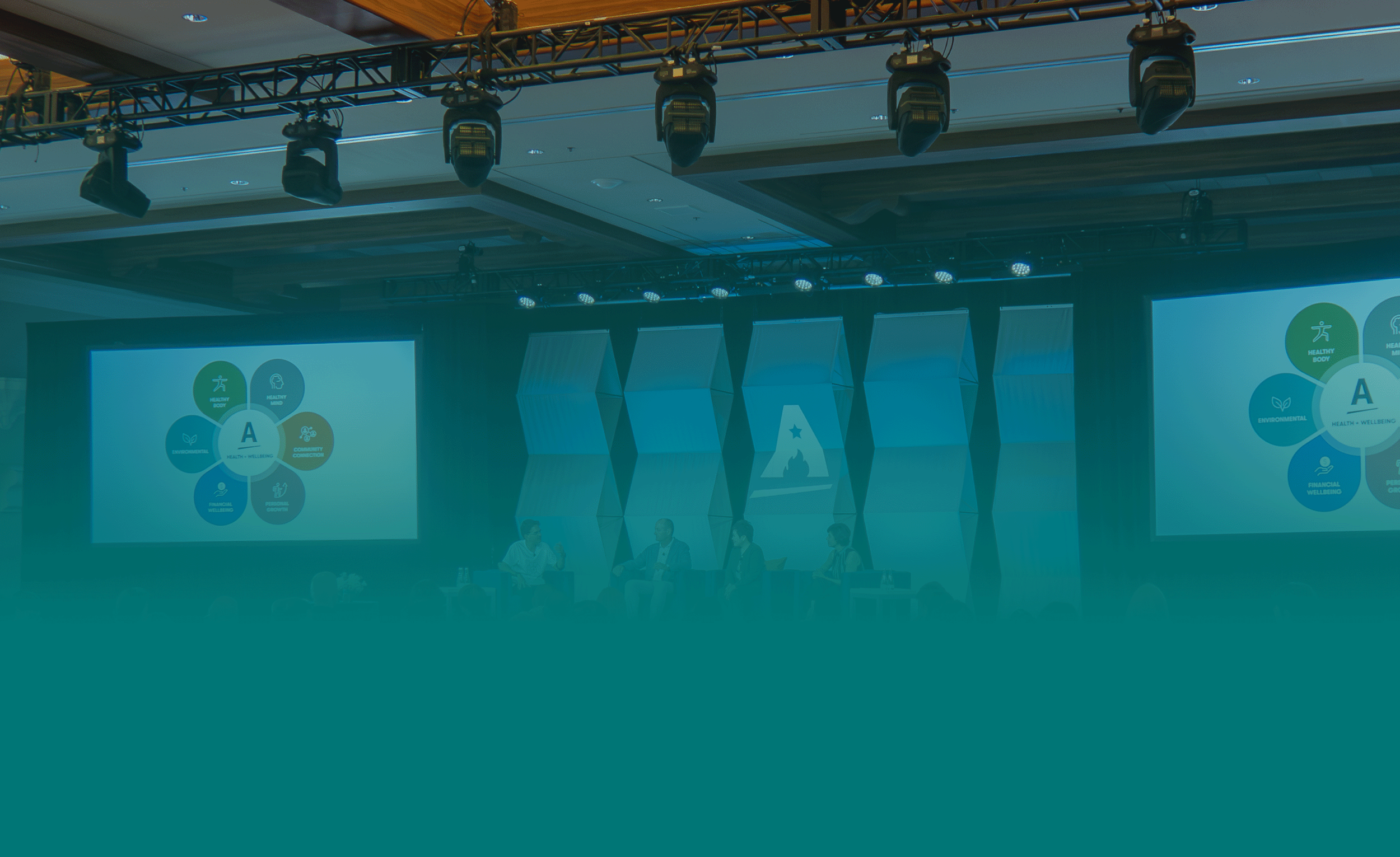
Staging and Venue Branding
The GrowthCamp brand came to life through a range of thoughtfully designed on-site graphics and environmental elements. This gallery showcases key pieces including window stickers, roll-up banners, and neon installations, highlighting how each element reinforced the visual identity and enhanced the overall experience.

Stage and presentation design for GrowthCamp 2023, showcasing a cohesive visual identity in action.
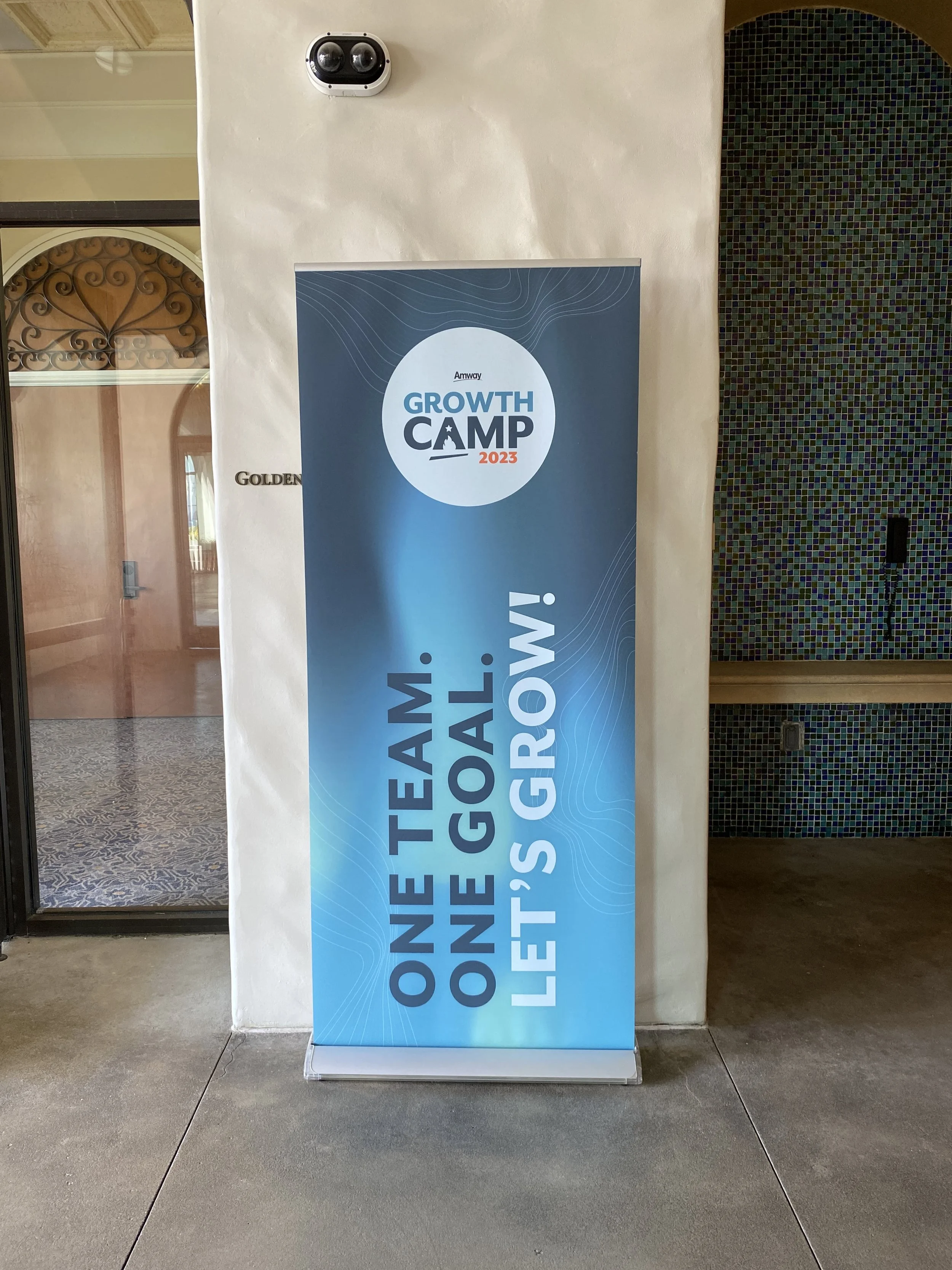
Roll-up banners placed throughout the venue to increase visibility of the event.
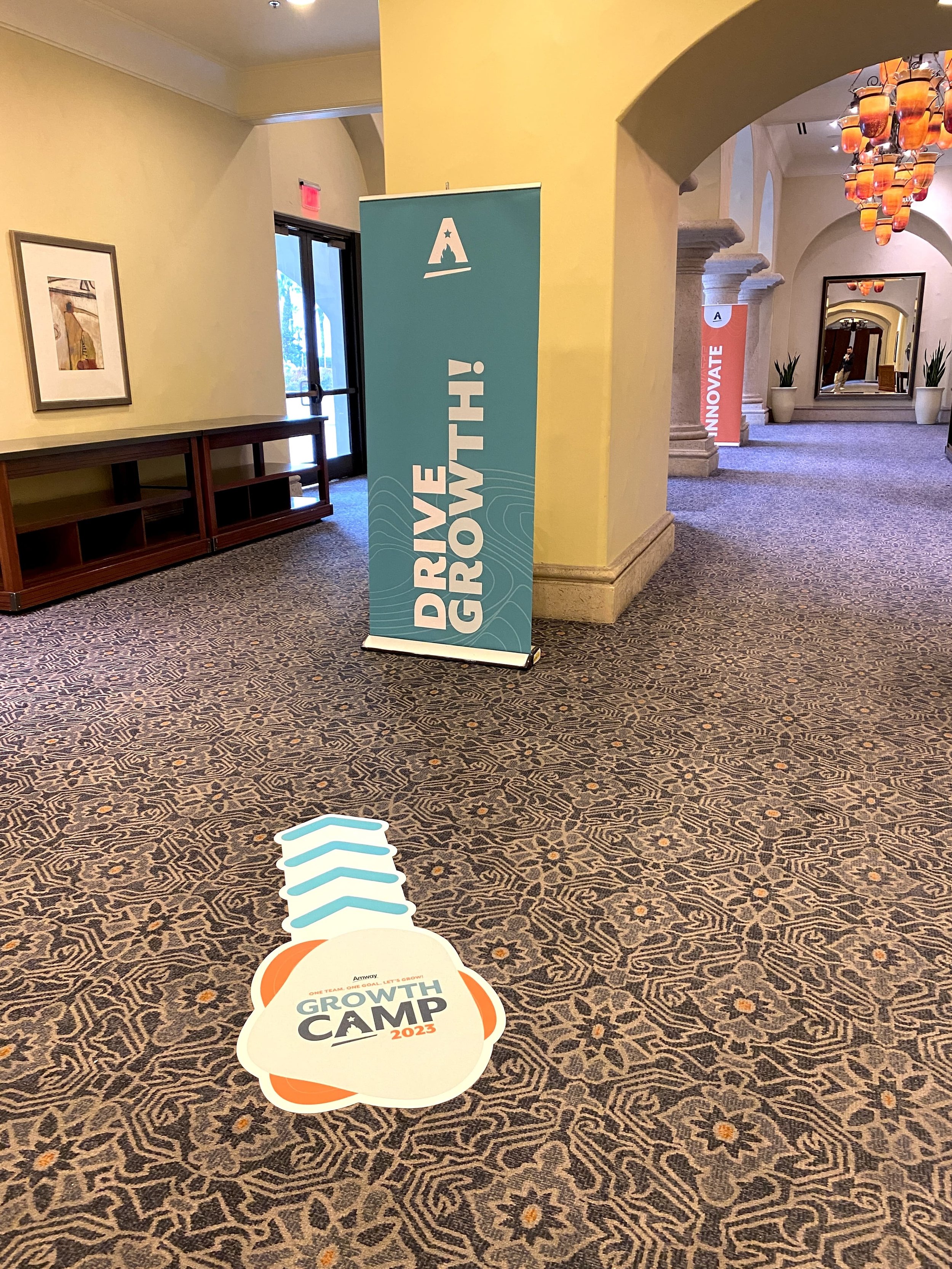
Roll-up banner paired with a floor sticker to guide guests toward the conference rooms
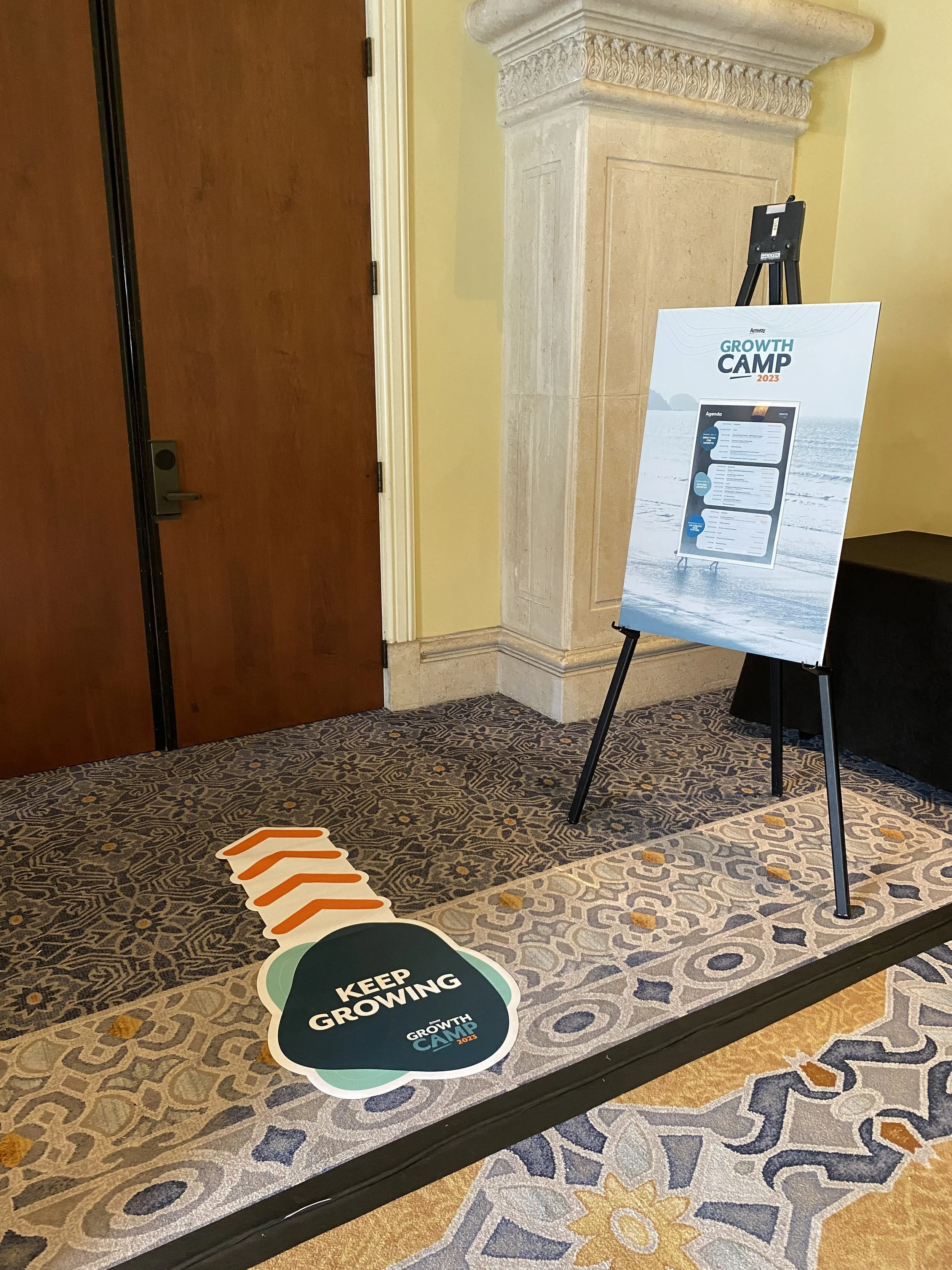
Floor sticker and easel board displaying the event agenda to help guests navigate.
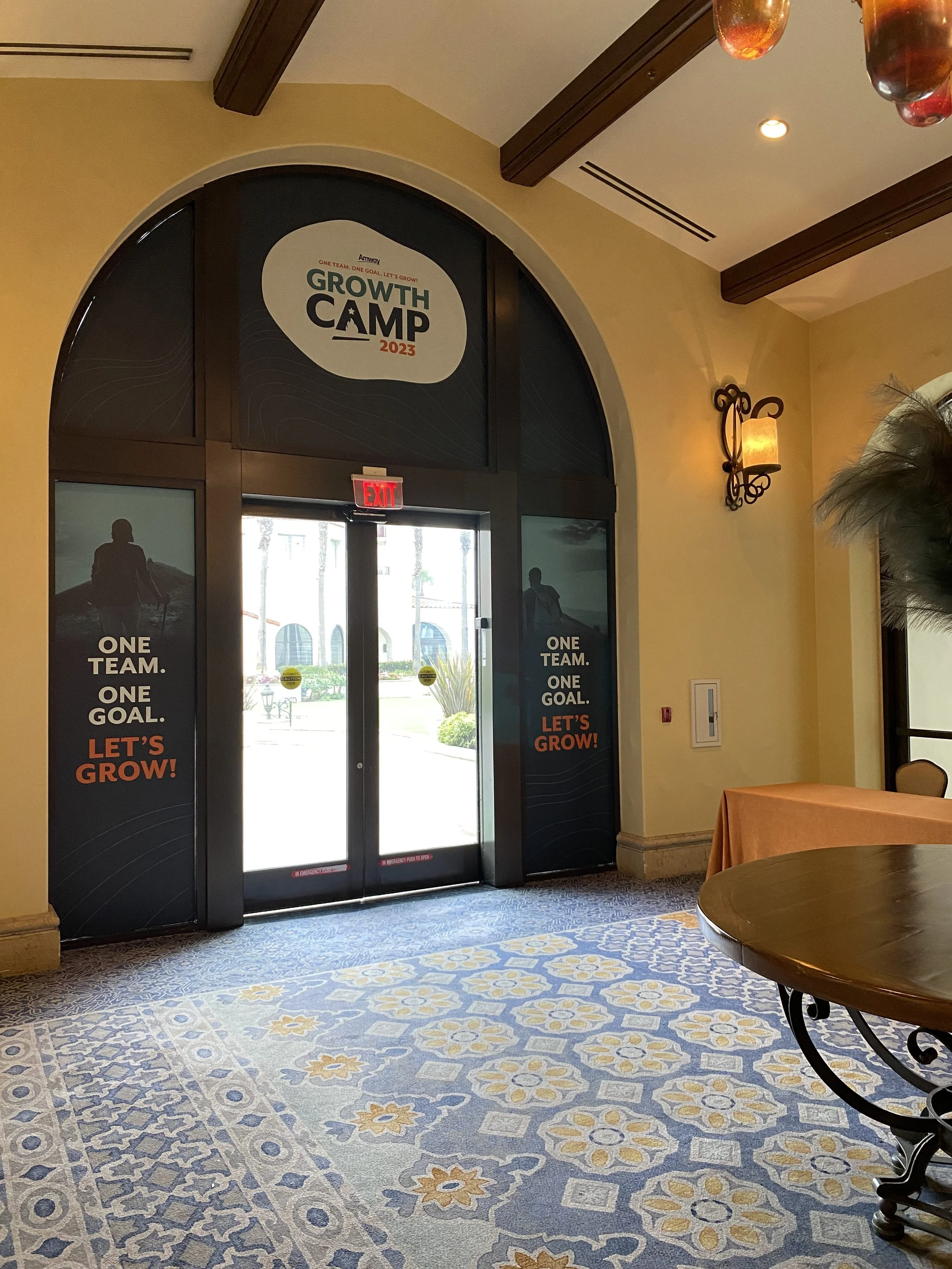
Window stickers at the main entrance guiding guests to the GrowthCamp 2023 experience (Indoor)

Window stickers at the main entrance guiding guests to the GrowthCamp 2023 experience (Outdoor)
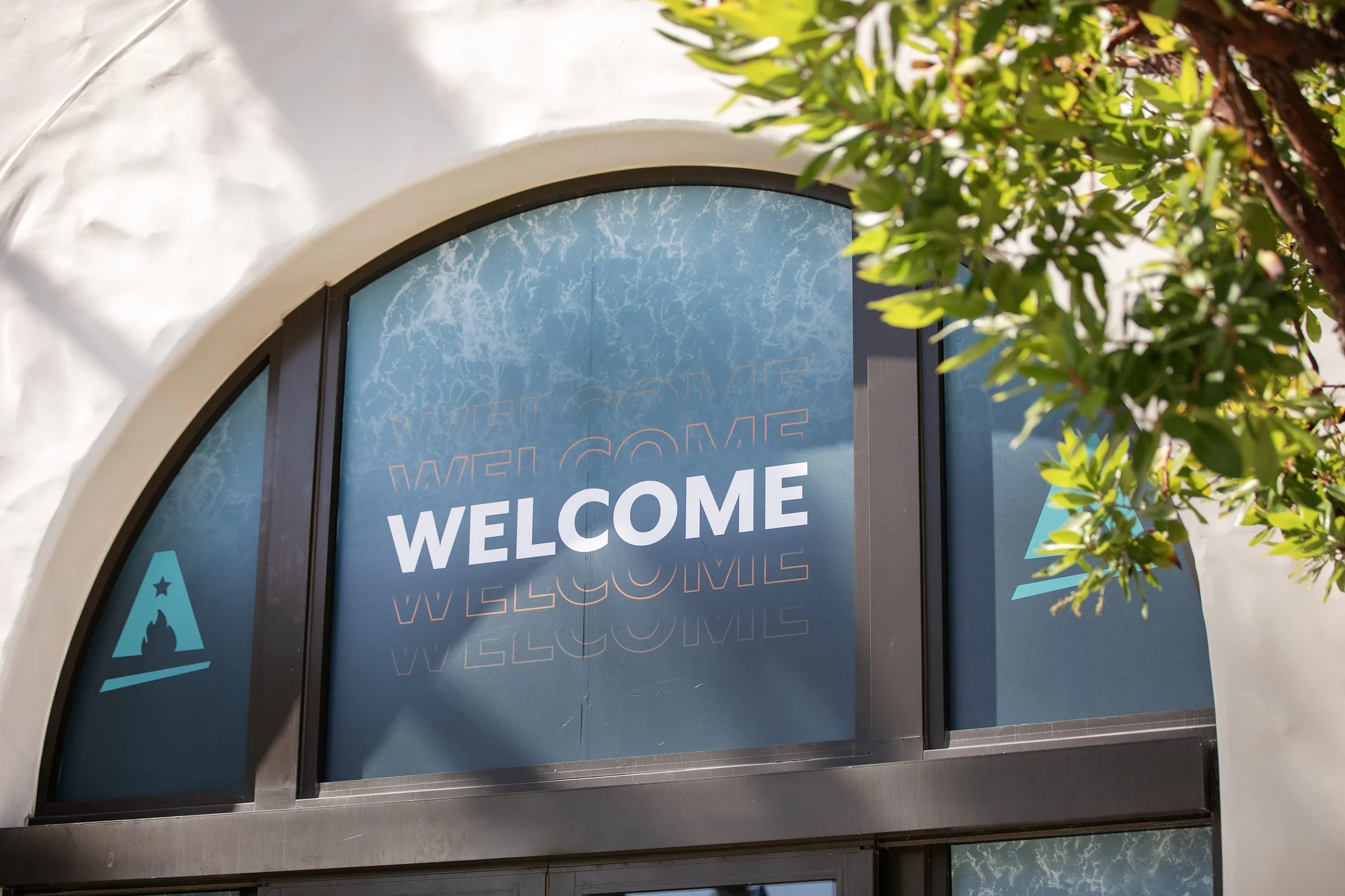
Window stickers at the main entrance guiding guests to the GrowthCamp 2023 experience (Outdoor)
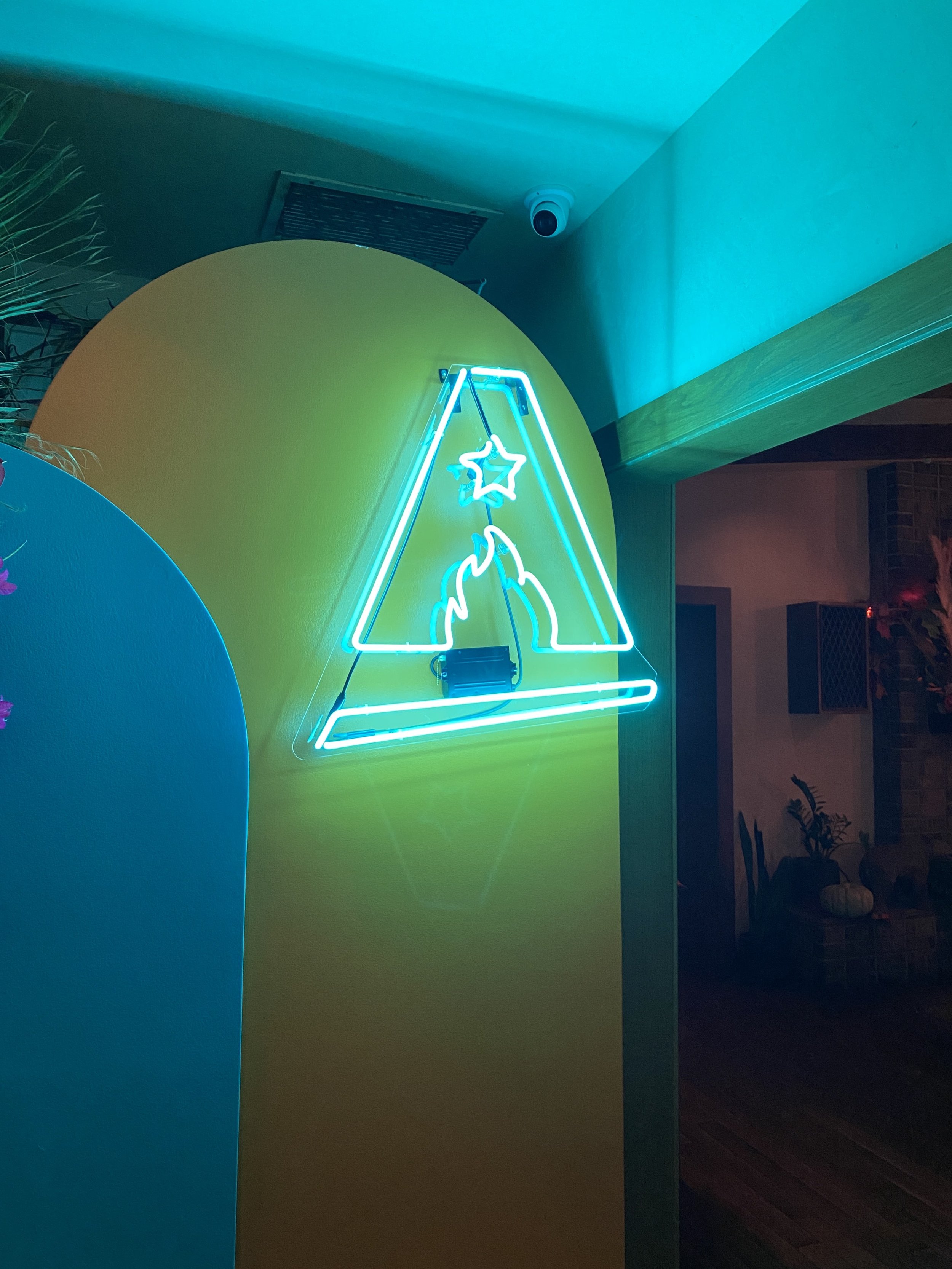
Neon sign featuring the GrowthCamp ‘A’ displayed at guest dinners to create a memorable atmosphere
OUTCOME
GrowthCamp 2023 successfully brought Amway’s culture to life, creating an experience that inspired connection, collaboration, and innovation among global leaders. The event demonstrated the power of cohesive branding to transform every touchpoint into a meaningful moment, leaving a lasting impression and setting a new standard for internal events.