
EVENT BRANDING
AMWAY GROWTHCAMP 2024
GrowthCamp unites Amway’s global leaders to inspire collaboration and strengthen connection. As the creative lead, I built the brand from the ground up, creating a cohesive visual identity that reflected the company’s mission and values. I designed every touchpoint, from engaging presentations and attendee materials to immersive event experiences with large-scale signage, stage design, and interactive elements that brought the brand to life before, during, and after the event.
BRAND IDENTITY DEVELOPMENT
Logo Design
When planning the 2024 edition of GrowthCamp the directors asked that the logo feature the Health and Wellbeing (H+W) flower, a meaningful emblem that represents Amway’s six domains of health and wellbeing and its commitment to a holistic approach to growth. This request shaped the creative direction, inspiring me to reinterpret the flower’s symbolism with a fresh, modern perspective.
The result is a refined version that preserves the heart of the original design while making it flexible enough to work seamlessly across every event touchpoint
BRAND IDENTITY DEVELOPMENT:
Iconography System and Color Palette
The iconography for GrowthCamp captures the essence of ‘One Team, One Goal, Let’s Grow’ and the six domains of the H+W flower through simple geometric forms. Each icon highlights a unique part of the collective journey with minimal, flexible design that gives equal weight to every domain.
The color palette was carefully chosen to reflect this balance, using distinct hues that evoke growth, energy, and optimism across all event materials and digital platforms.

BRAND IDENTITY DEVELOPMENT:
Brand Guidelines
To ensure consistency and clarity across every channel, I developed comprehensive brand guidelines for GrowthCamp 2024. The guide defined the correct use of core elements, including logo variations, clear space, and placement, along with approved color combinations and typographic hierarchy. It also established rules for integrating iconography, maintaining visual balance, and pairing photography with the brand’s graphic system.
This framework became an essential tool for both internal teams and external partners, ensuring that every application of the brand carried the same energy, precision, and sense of purpose.
Event graphics
The GrowthCamp 2024 identity was designed to extend beyond visuals and create a unified brand experience across every stage of the event. From first impressions on site to the tools leaders used throughout their sessions, each application reinforced the themes of health, wellbeing, and collective growth. By weaving the visual system into print, digital, and environmental graphics, the brand became an immersive presence that guided, inspired, and connected participants throughout their journey.
Post-Event: Unpacking GrowthCamp
To extend the impact of GrowthCamp 2024 beyond the event, I designed Unpacking GrowthCamp, a comprehensive visual summary capturing highlights, key insights, and memorable moments. The piece was crafted to be highly engaging, balancing clear storytelling with strong visual emphasis. Quotes from leaders were highlighted to reinforce important messages, while dynamic layouts made the content accessible and easy to navigate. This summary served as both a keepsake and a practical reference, allowing participants to revisit key learnings and carry the energy and inspiration of GrowthCamp into their work.
Event: On-Site Experience
During GrowthCamp 2024, every on-site touchpoint was designed to immerse participants in the brand and support engagement throughout the event. Custom name badges with lanyards helped leaders connect easily, while table tents provided relevant session information at a glance. Roll-up banners reinforced the visual identity and guided attendees through the space, and agendas and notebooks offered practical tools for note-taking, reflection, and participation. Together, these elements created a cohesive and engaging environment that encouraged collaboration, learning, and connection among global leaders.

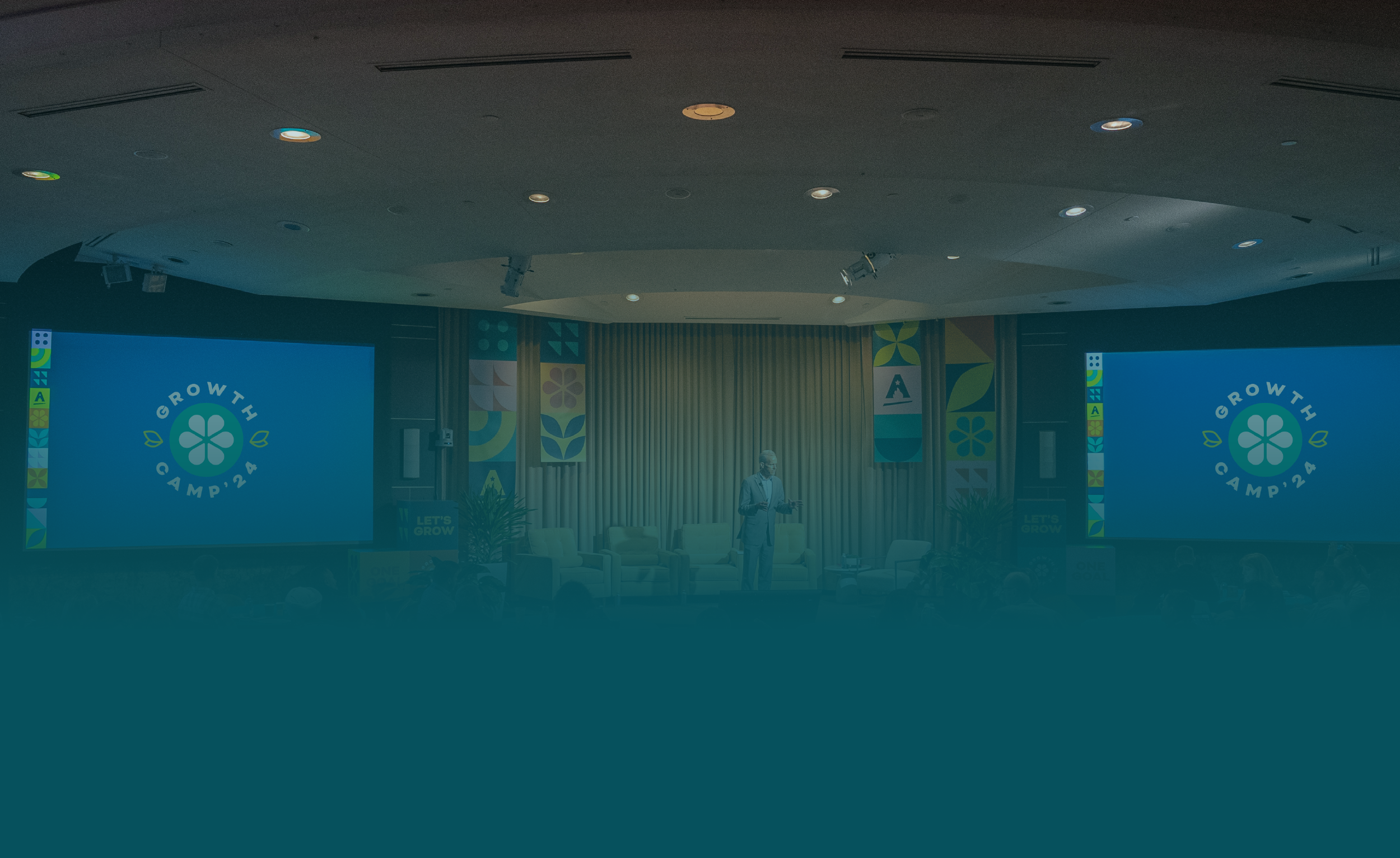
Staging and Venue Branding
The GrowthCamp 2024 identity transformed the venue into a fully branded environment that immersed leaders in the event experience. Large-format applications such as stage vinyls and cube stacks created bold focal points that anchored the space, while window clings and totems extended the brand into transitional areas, serving both informative and decorative functions. Each element was designed with intention, turning the venue into a cohesive landscape that guided attendees

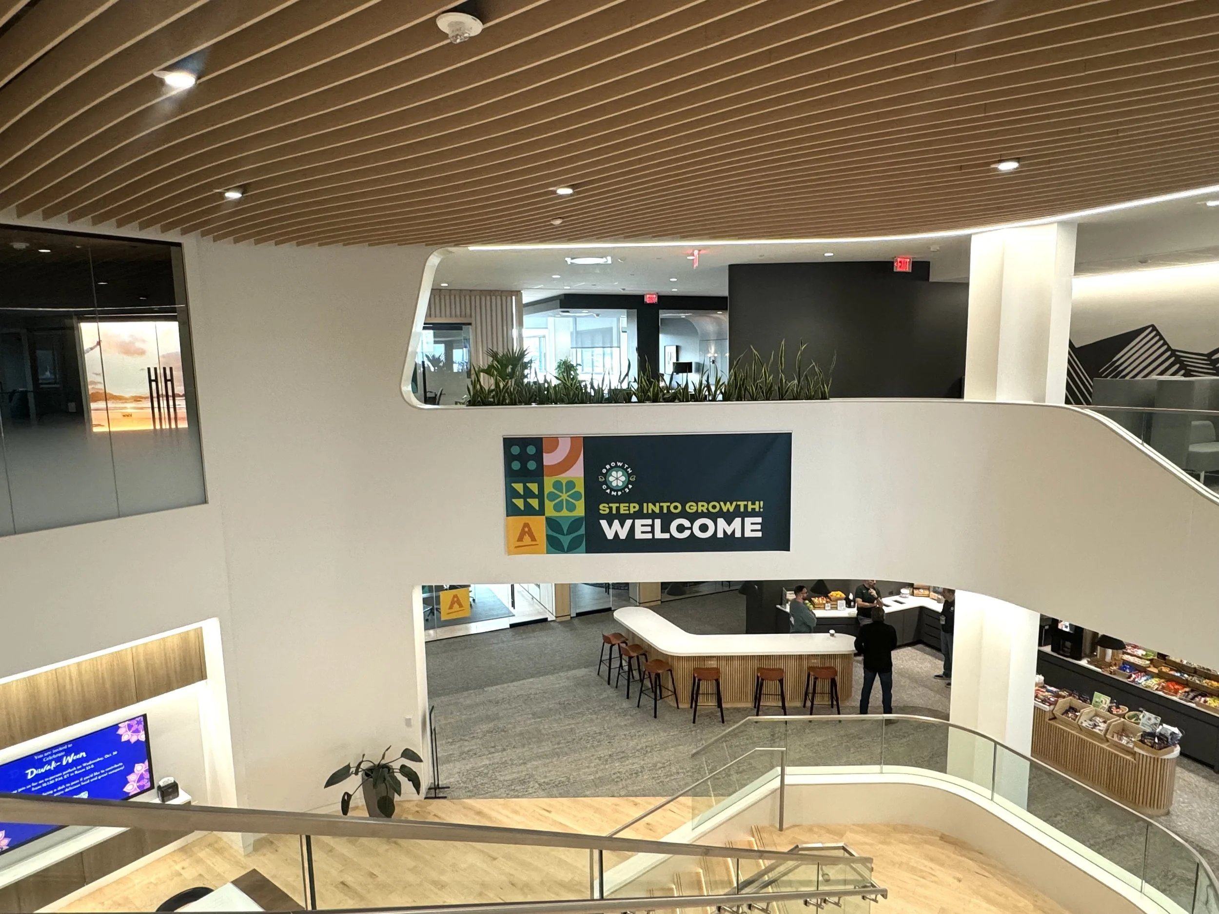
Setting Up the Lobby at Amway's WHQ

Window Cling located at Amway's WHQ Lobby

Empty Stage at Amway's WHQ

CEO Michael Nelson presenting at Amway's WHQ

Close Up to Stage Vinyls and Cube Stacks

Close Up to Cube Stacks created for the Stage

Close Up to Cube Stacks created for the Stage

Freestanding branded totems were placed at entrances to welcome guests and reinforce GrowthCamp’s visual identity.
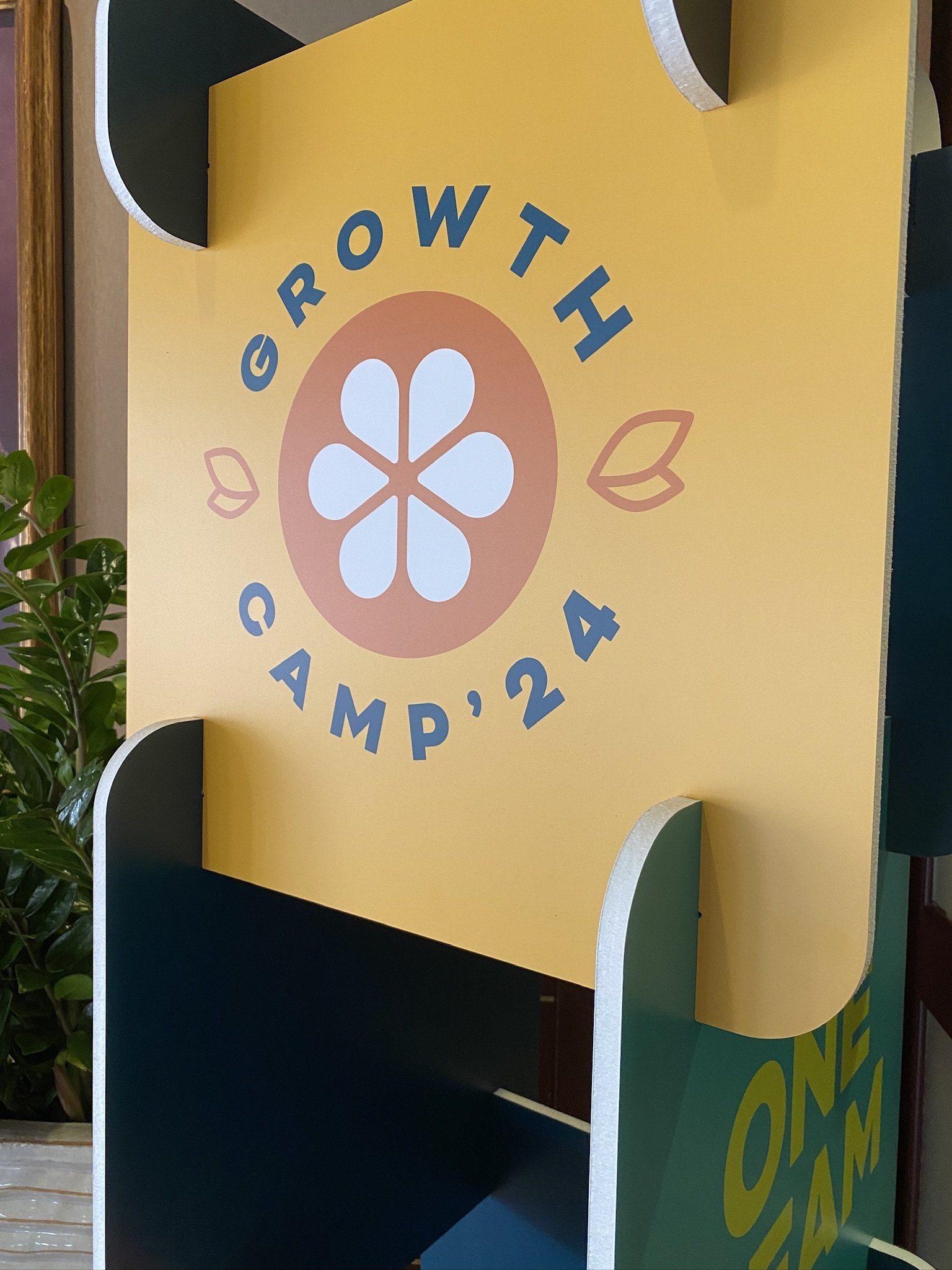
Close up to branded totems

Close up to branded totems

Animations created for screens located at Amway's Treehouse

Branded window clings were added to the Treehouse, providing privacy for group workshops.

Branded window clings
Welcome vinyl located at Amway's Treehouse

Close up to Welcome vinyl

Weight covers designed to hide the weights securing the Welcome vinyl signs.
Outcome
GrowthCamp 2024 delivered an experience that surpassed expectations, immersing leaders in Amway’s culture and strengthening the company’s focus on global collaboration and innovation. The event demonstrated how a cohesive brand can transform every touchpoint into a meaningful interaction, leaving a lasting impression and setting a new benchmark for internal events.